

could it be different?
reimagining the book cover of "A Generous Orthodoxy"

disclaimer #1: this excerpt is an exploration of what an alternate cover could be for a preexisting book. it is not meant as a slight against the designer of the original book, nor is to say that what i conceptualized is better. it’s a collection of thoughts on how what we see may or may not engage with us- and in turn, determine whether we pick up a book in our hands, or add to cart based on first impression.
disclaimer #2: i’m an illustrator and not a graphic designer. the two often get mistaken one for the other (or it’s the general assumption that if you have a creative bend that you are a jack-of-all-trades in the creative sphere. and i wish that was the truth!). one of the illustrations i’m going to share is going to require a bit of grace and imagination because an illustrator might know how to draw pretty pictures, but a designer can excel in the layout in a way that is pleasing to the eye- which is an opportunity for me. but, growth is one step at a time!
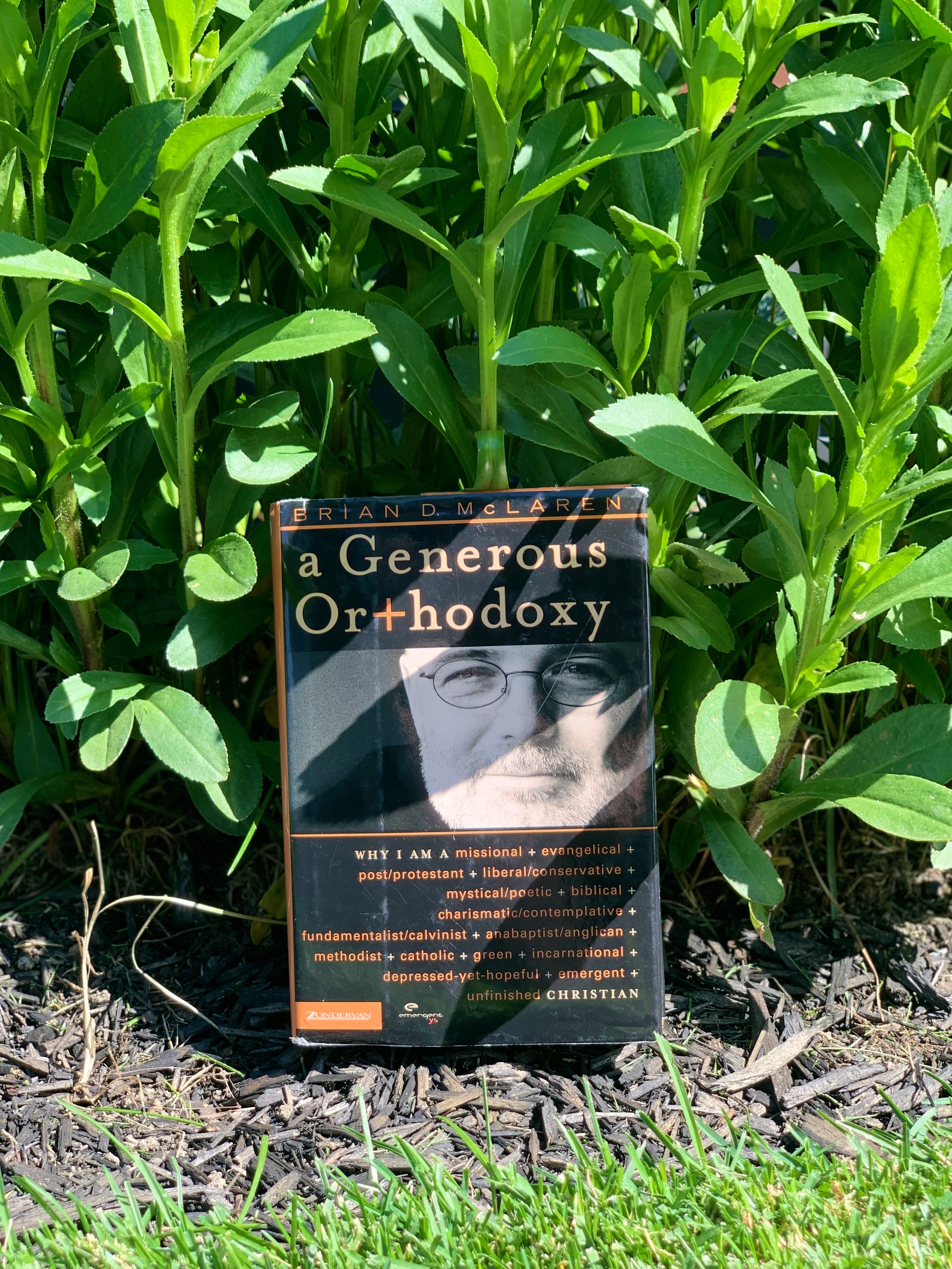
for 18 years, i have had a book sitting on my shelf that has been immensely formative in my faith practice and still provides wisdom to me to this very day.
however, since i brought it home, the cover of the book has never sat quite right with me.
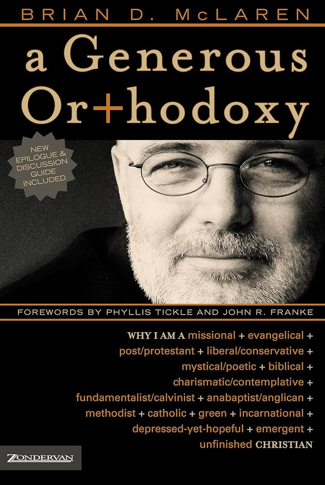
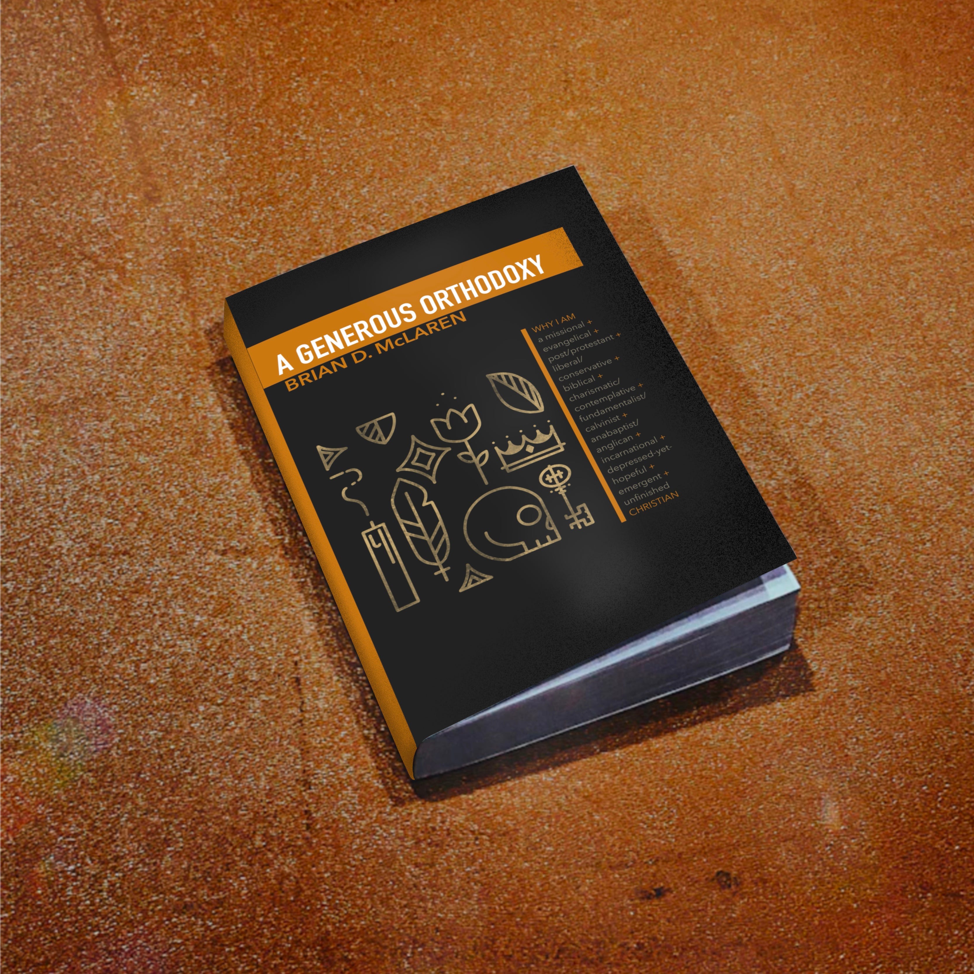
the book is “A Generous Orthodoxy” by Brian McLaren.
well, the actual title is: “A Generous Orthodoxy: Why I am a missional, evangelical, post/protestant, liberal/conservative, biblical, charismatic/contemplative, fundamentalist/calvinist, anabaptist/anglican, incarnational, depressed-yet-hopeful, emergent, unfinished Christian”- a title that no one should ever have to memorize!
this is one of my most recommended reads that i’ve shared with others (and the book cover and inside pages can attest to this, as they have been passed around to many different hands). it is also the most rejected book that i have shared with others. i have yet to share my physical copy with someone and not receive a list of things that were points of contention.
and i think that’s a great thing!
just as you may take 4 items into a change room at a clothing store, and walk out with one- or none- because they simply did not fit your shape, or the material didn’t feel right against your skin- it is just as important to read in this manner as well.
when this borrowed book is returned back with rejection, it is still meaningful that someone would take the time to connect with something that resonated with me and see if it fits in their life.
the full, lengthy title is exactly what this book is about: a manifesto of personal faith and exploring differing viewpoints, the space that they may hold for us in our journeys, and that may or may not point to the same destination. what i admire about the book is that McLaren never really outlines what is/isn’t “orthodox”, but leaves that up to the reader to decide. This likely one of the reasons why it is widely rejected: the author isn’t telling you what to think, but to choose your own adventure. if you go through the list in the title or the topics explored, they are traditionally very divisive. however, he approaches this from a posture of “we” rather than “us/them”. i don’t often go online to read negative reviews, but one of the reviews on amazon describes this book as being “organic composting”, and that makes me laugh a little. at the time of release, it received quite a bit of criticism as being “new age”. but, so was yoga. and wine. the term “new age” has always had me puzzled in a bit in that the core beliefs tend to be rooted in the past and the framework of ancient ideas. it’s a revisiting of what was, what worked and what didn’t, and how we can take those beliefs and apply them in our current context and circumstances.
my initial reaction to reading this book at 2am in my dorm room was:
can he even do that?!
how can one person divide themselves into so many segments?
this was one of the first reads that opened my eyes to a “both/and” possibility.
not everything had to be extreme in terms of beliefs. nor is that particularly healthy. when we plant our feet firm in the ground without revisiting why we were standing so stiff and rigid in the first place, we lose the opportunity for potential growth (and maybe growth means that you affirm your existing stance from a new perspective).
now that you are equipped a healthy amount of context, let’s talk about the cover:
for having an incredibly lengthy title, the cover is both simple and yet crowded.
what has always struck me as a bit strange is that the author’s face takes up half of the cover itself. something that you often see with autobiographies. Arnold Schwarzenegger did the same with his and i would expect as much- but, i you and i know Arnold well enough to drop a quote or two of his. in 2006, i had no clue who Brian McLaren was or why his face was on the cover. the only rationale i had was that this was his story and he was owning the opposing and seemingly conflicting viewpoints.
but, despite your celebrity status, i think it can be very ballsy to drop your photo on the front cover of a book.
secondly, i’m a bit of a font snob. the mixing of the serif and sans serif fonts make me tweak a little bit. but, perhaps that’s further representation of the blending of the concepts of what was old and looking at it in a new light. (i’m also a bit of a hypocrite here because i created the thumbnail for this post with a mix of fonts. but, let’s just pretend that was representative of this book. sounds good? okay, cool. cool. cool. cool.)
one of the things that works well on a personal level is the color orange: from being obsessed with all things fall and pumpkins to working at home depot for 14 years- the color does a lot for me! in color psychology, the color orange is often used to represent optimism, enthusiasm, and the rejuvenation of one’s spirit.
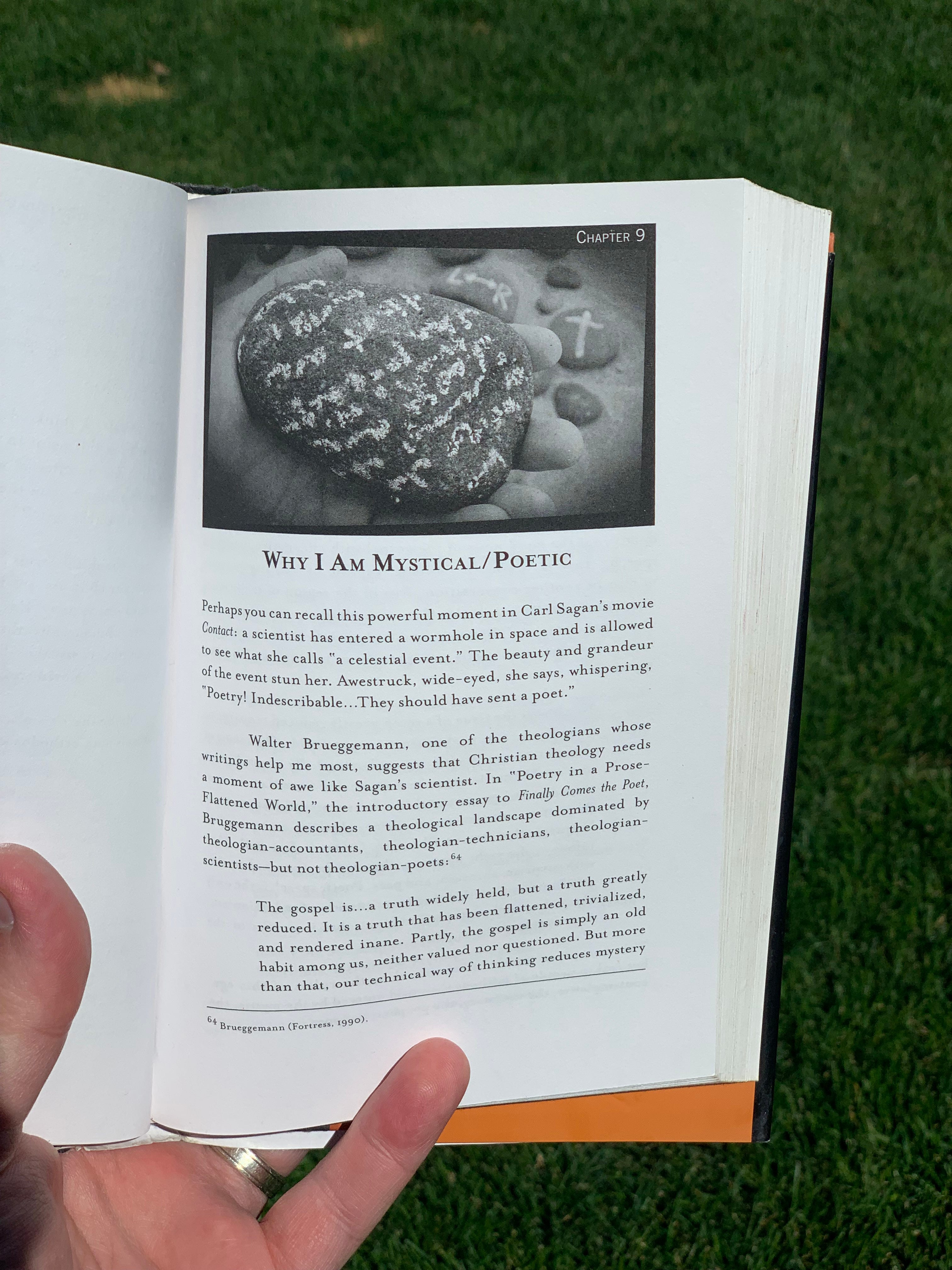
where this cover really fell short is that i don’t think it represents what the book itself reveals. for example, at the beginning of each chapter is a photograph of a rock with a chalk drawing of a symbol that the chapter represents. there are graphs, charts, and diagrams of different schools of thought and these elements combined offer a visual and tactile experience. it’s something that i think the cover had so much opportunity to invite the reader into. my gut impulse is that, had this book not been recommended to me by someone who i deeply respect, i likely wouldn’t have read it. the appearance says “text book” to me- which works for some, but not most.
THE REDESIGN:
when i set out to reimagine this book cover, i wanted to highlight and lean into the symbolism presented throughout the book. icons are integral to humanity and are currently at an all time high. with increased globalization, we thrive on symbols that span across various cultures. even down to the apps on our phones, symbols are a language within themselves. i chose symbols that tied tightly into the subtitle of the book and also were open to interpretation to the viewer. these are icons that have universal familiarity. i also distressed them a bit to pay homage to them being ancient concepts and symbols. you may notice that there is no symbol for a cross on the cover, which may cause some controversy. the question that i asked myself is does it NEED a cross? i often question the necessity of dropping a cross on every christian document. there is validity in utilizing multiple symbols to express faith and belief because we all connect to spirituality in unique ways. for myself, an image of a turtle has been more impactful in my time when i was in a pastoral role than a cross because it was a reminder to “slow down” and practice a pace in which i could absorb the lessons that life was teaching me. i can assure you that if a cross were in this grouping of symbols, your eyes would immediately go straight to it and a level of bias would exist.
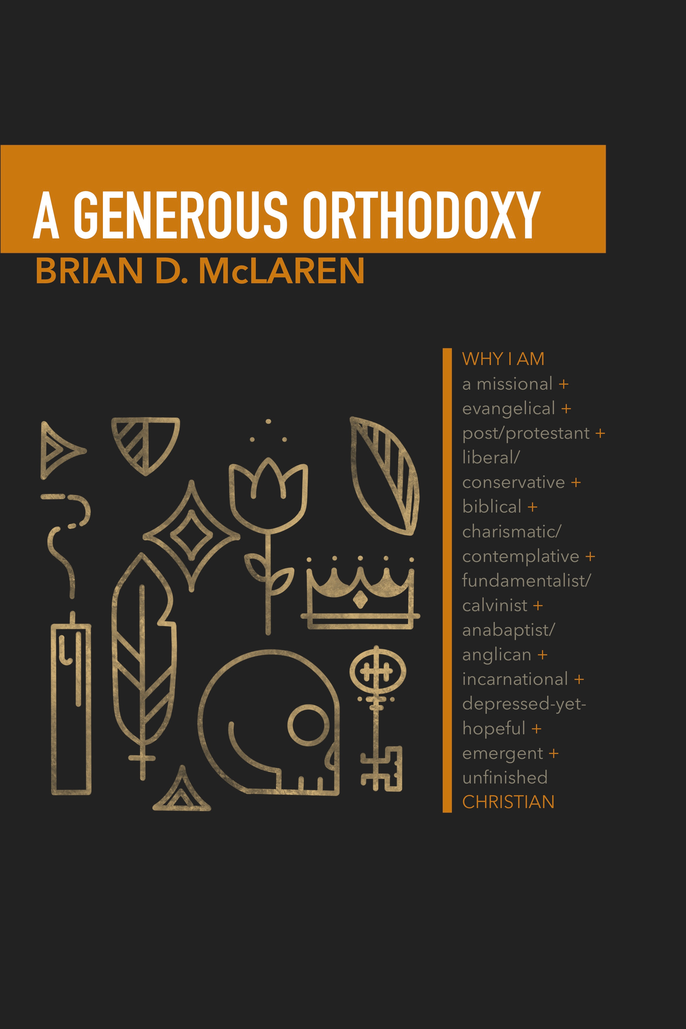
for the title and author’s name, i wanted to respect simplicity and leave some visual negative space. all it needed was a block of color to contrast and make it pop.
for the background, i think the black worked well on the original cover, but design overall is tending to stray away from true and solid blacks, and are softening them up slightly to be more appealing and less rigid. we see this all the way down to matte black finishes that are trending in home decor.
on the original design, the incredibly lengthy title took up over a third of the cover space. in this redesign, i thought that it was important for the symbols to do the talking.
personally, i’m quite content with the redesign (even though i’m not a graphic designer and it could definitely use a few more tweaks to make this work)- and if zondervan wants to use this variant for a new edition- brilliant- i shall humbly accept their offer. this is a pretty rough draft of what i would actually do to refine it, but my primary goal was to focus solely on concept and spent only half an hour on actually bringing the concept into fruition.
i think that it’s important to highlight again:
this is a reimagining. and isn’t to say that the previous cover didn’t work (the book has sold in 190 different countries, so it certainly has done something right).
only the author (or publisher) can best make the decision of what the representation of the written word should be. but, i will continue to emphasize the point that what you on the exterior of your book will send an immediate statement to the viewer. make it count.
if nothing else, this was a fun practice to engage in and consider the question:
”could it be different?”
*if you have a book cover suggestion that you think could use a revamp- drop it in the comments and maybe it’ll be my next cover rework!*
many years ago, one of my favorite albums, Seven Swans by Sufjan Stevens, was reimagined by several other musicians from his record label and friends. i was astounded by how they were completely able to rework his music in a way that honored his work, but also did so with their unique style. that’s what i’m aiming to do with these book covers as i reimagine them. if this goes well, i plan on doing more. actually, i take that back- i’m going to keep on doing these regardless because i’m having fun creating them. :)
I love this! It is distinctly what makes you as a creator unique and incredibly talented. I love this new season you are in, man!