y’all ready for some happiness? me too.
in every house that i’ve owned, it’s to add some unique flair and personality to each one.
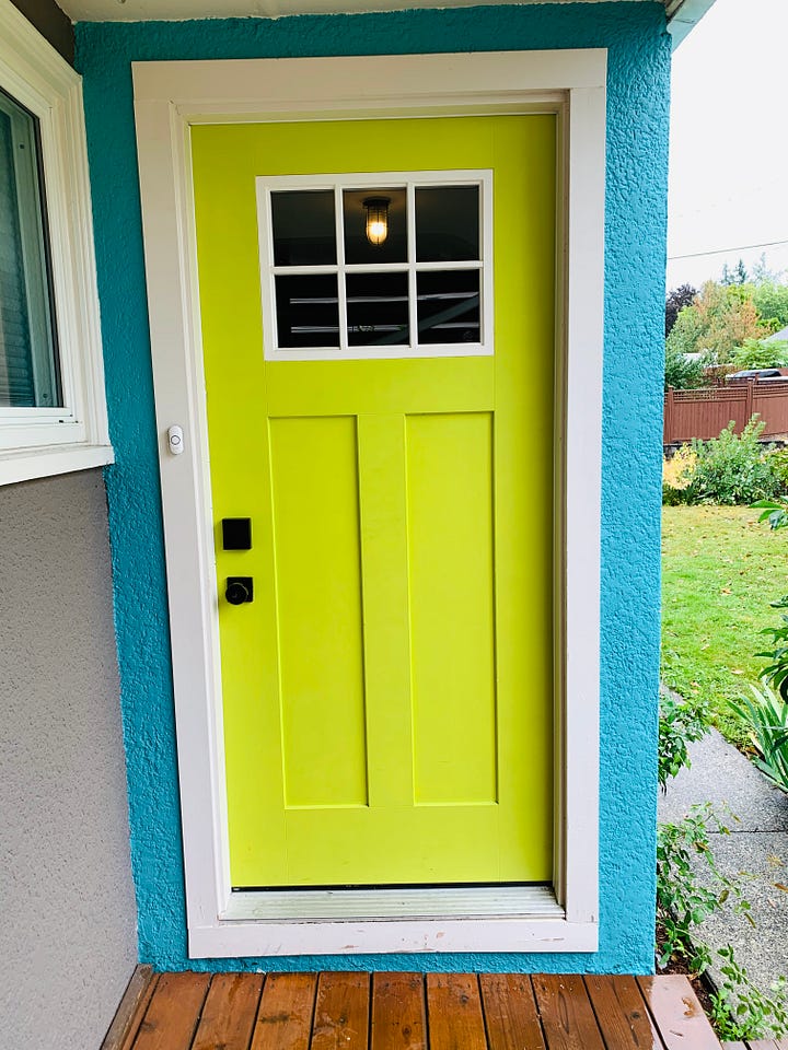
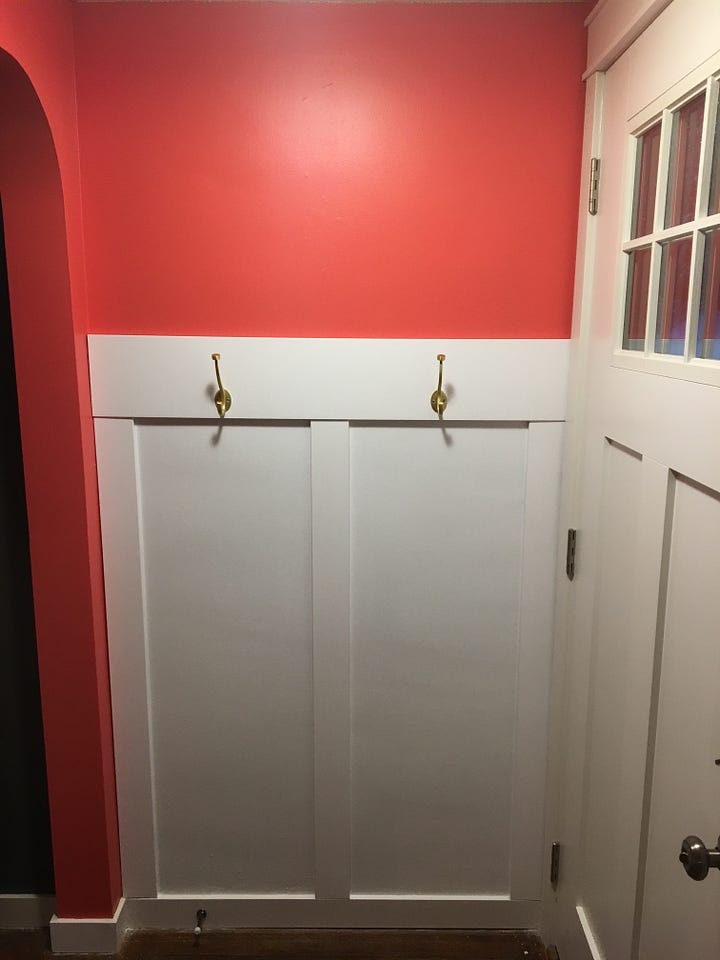
in the first apartment, the living room window feature wall was painted a hot pink color called “peony”. the second house owned was built in the 50s and needed a lot of love- things got a bit erratic and the exterior was painted an electric blue with a bright green door (i think that the name of that paint color was “anime”). in the current house, the creative wings are spreading a little slower. the tricky thing is that the house is brand new, and it’s difficult to paint and refinish things that were just done. more importantly, sometimes i think that you need to learn how to live in the space before you begin to make it your own. there’s an element of feeling out the functionality and even the personality of the house itself before you redeem it with a coat of paint.
years ago, a woman stopped by while i was gardening outside. she shared that she intentionally walked past the house with her dog every day- for the simple reason that the bright blue house made her smile and brought joy to her life. and she was so thankful for that!
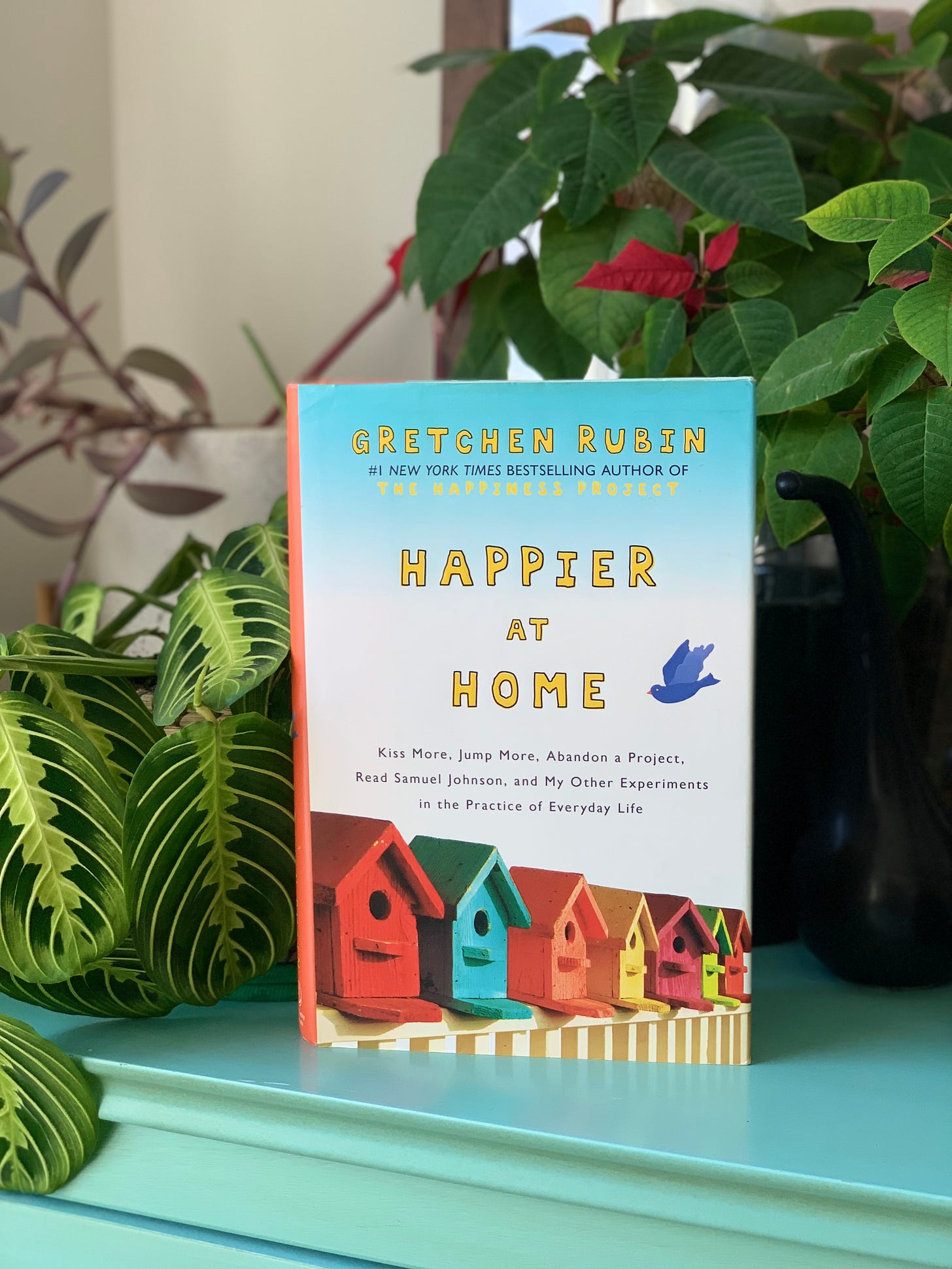
“Happier at Home” by Gretchen Rubin is a solid read. it could easily have slipped into a trendy self-help manifesto. instead, she shares seasons of her home, stories that were woven into the walls of where she lived, and provides insight on how our homes are sacred spaces. “Happier at Home” was written after Rubin’s bestselling book “The Happiness Project” through her experiment, she discovered that her home was one of the most crucial elements in affecting her happiness. and this isn’t unique to her circumstances in any stretch.
this book gave me a hard reset as to how i viewed my own home, and considered new thoughts such as:
“It wasn't the amount of stuff; it was the engagement with that stuff [that mattered for happiness].”- Gretchen Rubin
this book gave me permission for being a hermit in my home and proud of it and is layered with other truths.
and i’m not just talking marie-kondo-hold-it-in-your-hands-and-ask-yourself-if-you-love-it-and-tell-it-how-much-you-appreciate-it- BS wisdom…
i told myself that i wouldn’t use the dreaded “C” word during this post… but, i can’t help myself. i know we hate the “C” word and it triggers so many of us. but, for context, i have to do it- please forgive me…
i read this book in a different light now in a post-C word-world.
(the C word is covid. i’m sorry, guys).
during the pandemic, many of us were able to have a reset, clear out clutter and learn to fall in love with our homes again. while, some began to feel trapped with a general disdain and now escaped every chance they get (vacations for days).
a truth that this book reminded me of was how there are things in my life that i can control- even when things are spinning out of control. and home is the best place to make these things happen- to gain control of your living space.
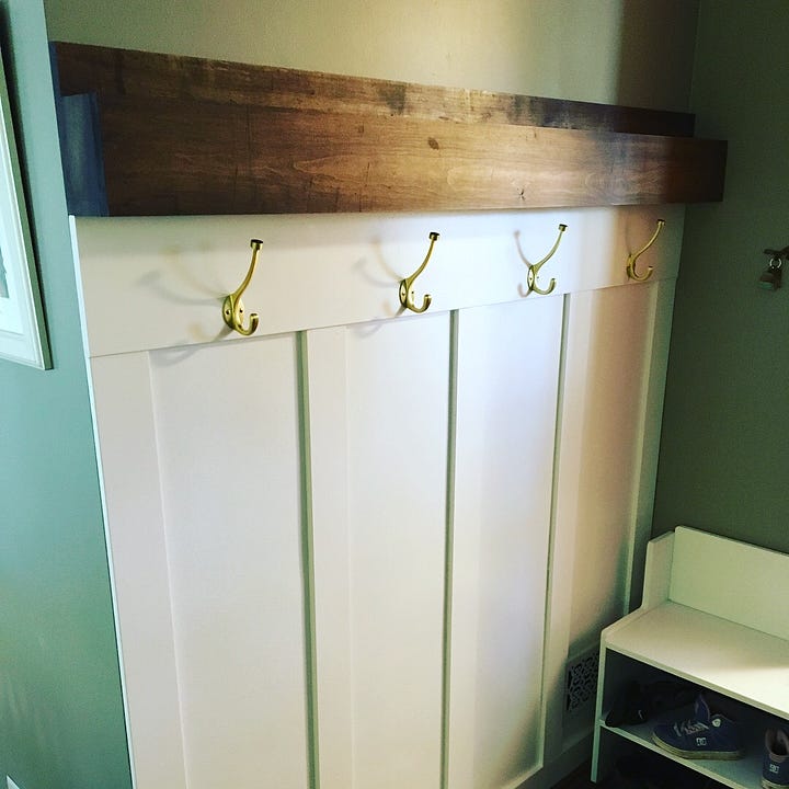
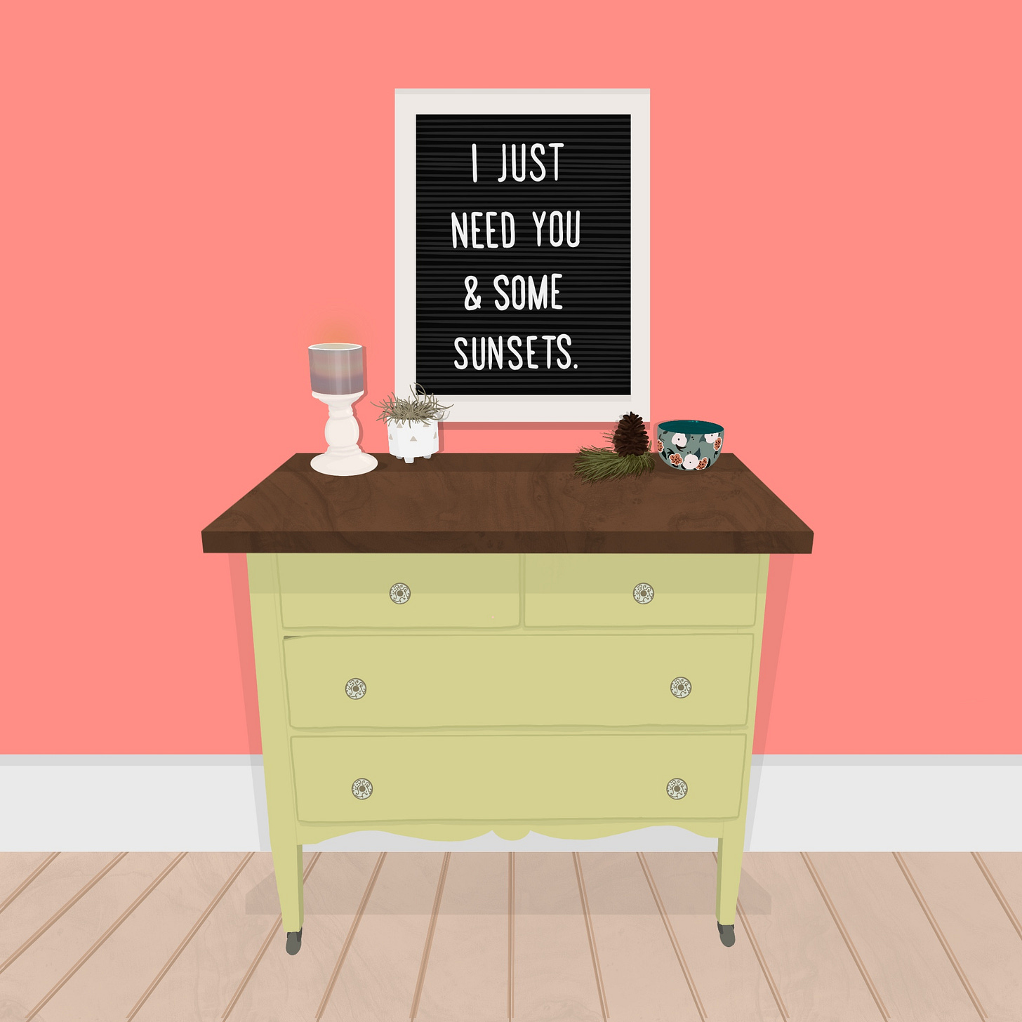
i might not be able to control the tone in which my boss speaks to me in while i’m at work, but i can control which wall i place my sofa against. i can control the walls that i paint, and details down to the temperature of lightbulbs that are above my bathroom vanity. i can even control how many houseplants i can have in my living room before i am considered to be clinically insane. above all: i can control the letterboard in my entryway: an area that i like to rearrange the message on often to reflect the season of life or even a humorous quote. the main sacrifice for all of these things is time. however, i see it more as an investment on enjoying the times to come more fully.
alright, it’s cover time!
*i need a jingle here. i have no clue what it would sound like. but it would certainly be cheesy. or cringey as my kids would tell me. cringe is the new cheese*
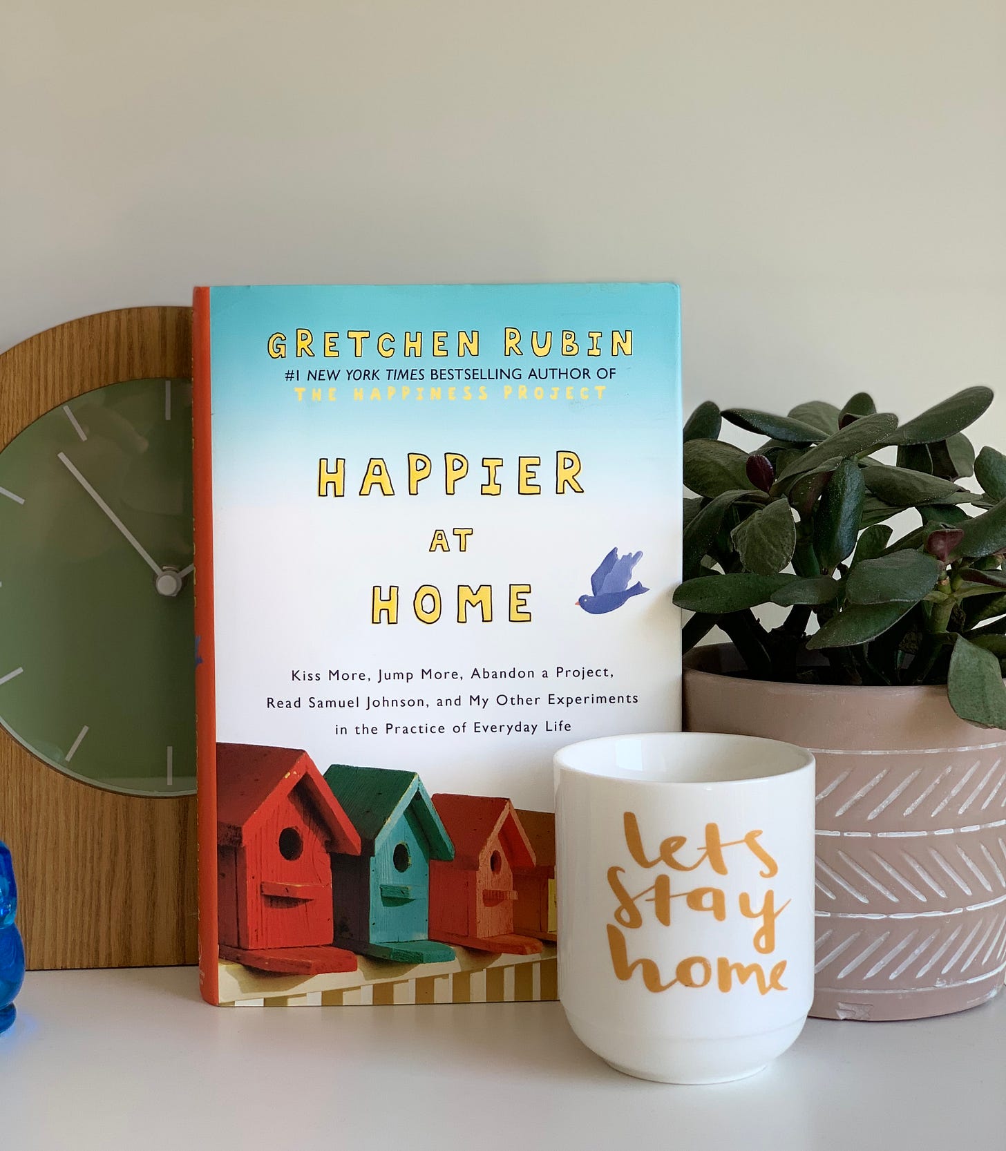
to sum up the cover, two words that come to mind are “bright” and “cheerful”. you’ve got a rainbow of birdhouses lined up with a bird flying overhead. i’ve always wondered which home the bird lives in- surely not the blue one because those blues would clash terribly! my guess is that he’s taking up residence in the yellow house.
speaking of our new feathered friend: the periwinkle bird is a bit tricky for me- i love the concept of the bird with the many multi-colored birdhouses represented, but i can’t see a blue bird in this style and not associate it with twitter. (or X. or the artist formally known as “social media”- whatever we’re calling things these days). and that says a lot coming from someone who doesn’t even have a twitter account!
the font reminds me of the one used for the movie Juno. maybe that was a early 2010s vibe. (and if you’re a #1 New York Times Bestselling Author- you better believe that the status you’ve earned is going right up top! i laugh because that statement is easier to read with the color contrast than the title of the book that she’s the Bestselling Author of! a laughing emoji would go right here. but, i’m still figuring out proper substack etiquette- do serious writers use emojis in their writing? screw it- i’m going to do it anyways: 😂)
i think that what brings me the most joy is the spine of the book with its bright tomato red presence. it makes me a bit nauseous to see how often a book spine is overlooked in the creation of a book cover. PEOPLE! UTILIZE THE SPINE! once someone gets your book home, and rests it on their shelf, this is the way of allowing your book to stand out from the rest! if you have personally written a book and used a black spine with a times new roman font with the title and your name, i need you to go back and reflect on your life choices. they say that the devil is in the details. and when it comes to books, i love a good spine more than a chiropractor does on pay day!
THE REDESIGN:
let’s get one thing clear: i think that this book already has a great cover. there are pops of color, it reflects the overall message and theme of happiness in the book, and essentially is an extension of the cover of the original book (“The Happiness Project”) that inspired this one. where i would consider taking this in a different direction would be to take the visuals into the interior of the home itself- which the majority of this book’s content resides in (yup, all sorts of good “home-related” puns going on in here). the danger: we all have varied tastes and decor decisions. you may prefer the cool, crisp white walls with gray floorboards and sleek modern finishes, whereas i may prefer a cozy cabin. (spoiler alert: being the illustrator, we’re going to try my idea first! but, i’m open to feedback.)
the more i worked on this cover, the word hygge kept coming to mind. if you aren’t familiar with the concept, hygge is a danish way of living that promotes a cozy atmosphere and spending it with the people that you love. as i took a leap into that territory, some nordic designs began to accompany. this is the living room where elsa and anna would have a chill afternoon with some hot apple cider. the title itself became part of the home decor through the use of a framed image, a decorative paper with washi tape and a pennant.
a couple of points to make about the area rug: first, it’s very reminiscent of the one in my own living room (subconsciously, i think we often create from what we know). secondly: how in the hell did the area rug end up underneath the fire place? and is that even safe? i’m imagining joanna gaines putting together this room, building a fireplace over top of an area rug and saying “this is fine. it really grounds the space”. you might have missed it, but there is a nod to a bird that is similar to the original book cover. this one blends into the space with the color palette (and this bird has feet of steel with being able to sit on the fireplace!). the color palette definitely has a boho vibe to it. originally, i was disciplined to using only 4 colors. but, somehow that 4 turned into 12. and i did shout out that Gretchen Rubin was a #1 New York Times Bestselling Author because the woman earned that crown!
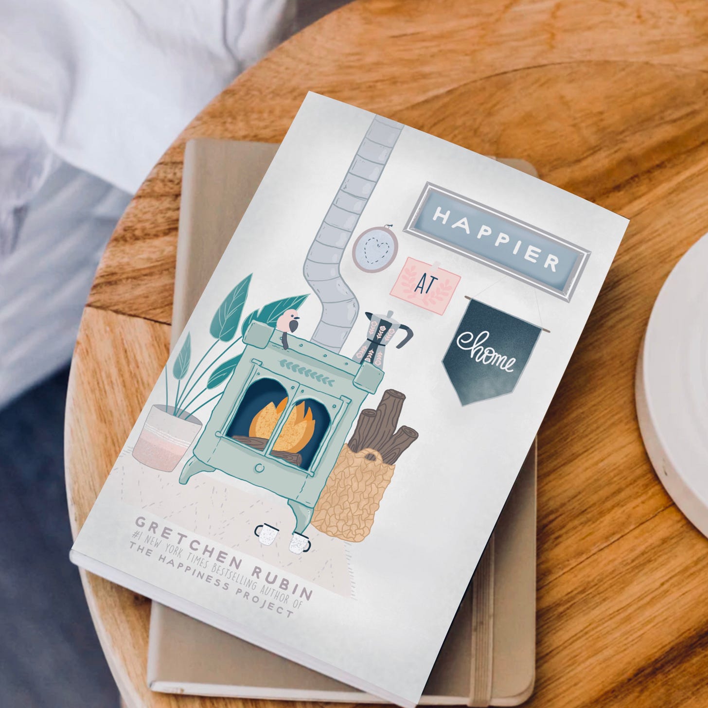
there are a few things that i’m on the fence about. i’m unsure if i like the negative space on the right side of the cover. i think that it could have used a cozy arm chair. having the title become part of the wall decor was clever, but it does feel a bit lost in the mix. my original vision for the cover was to give it some moody hunter green tones with warm wood to contrast it. i began this illustration with the fireplace and then built out from there. the reality is that a book cover like this would likely do very well- it’s what i like to call “art that sells”. you could stop at a HomeGoods store and literally purchase everything in this image (except for the fireplace). this also means that this art is going to become dated very quickly. someone may look at this 10 years from now and think “wow, that’s so 2020!”- which is a risk you run with any art. i’m not sure the word “timeless” is applicable to art simple because art does capture a moment in time. if anything, it should be the opposite of timeless and should be a representation of when it was created.
my verdict: i like the original book cover better. the vibrancy really pulls you in. i’m still not convinced that it fully captures the content of the book- but, it was enough to draw me in and am currently on my fourth reading of it.
dear Randomhouse Publishing: thank you for your consideration with my attempt, but it’s in our best interest to move on. you done good.
once again, thank you for indulging me on this cover redesign journey.
it’s a good practice to assess how we look at the visuals around us, the messages that they send, and how we interpret them.
*if you have a book cover suggestion that you think could use a revamp- drop it in the comments and maybe it’ll be my next cover rework!*







I might be bias, but I actually enjoy your cover more. It’s more appealing to my eye, more intriguing because it’s not too busy.
Regardless, well done! I always enjoy your work, Steve.